WithYou.
Forging loyalty and familiarity with local businesses, one paperless coupon at a time.
Project Timeline: 3 week sprint
Client: WithYou
Role: UX Designer and Project Manager
Teammates: Angel Damion Robles and Michael Kwok
What is WithYou?
WithYou is a Chicago-area based application that allows both customers and local businesses to interact, share, and redeem coupon offers. The platform scans and uploads direct mail pieces to encourage users to digitize their paper coupons.
Local businesses don’t have the resources necessary to produce paper-based offers in large quantities. Thus, WithYou is intended to also serve as an asset for these independent stores to get their name out by uploading coupons in a digital platform while forgoing the expensive costs of paper distributions.
Ultimately, WithYou seeks to:
Foster greater community engagement between independent business owners and loyal customers. And, going paperless is environmentally friendly and cost-effective!
However, despite its seemingly useful coupon digitization function and environmentally-conscious message, WithYou in its original iteration suffered from some problems.
According to the WithYou’s CEO, Ted Brockman, user retention proved to be its main challenge. It was clear to Ted that too many users were dropping off during the onboarding process of the application and not fully benefiting from the app’s intended usage.
Project Context
Our client’s issues
Our clients expressed several concerns as to what may have been contributing to their lack of user growth. After some discussion, we identified several pain points causing this user disruption:
User confusion over what offers are new versus old.
Greater user drop-off during the sign-up/onboarding process.
An audience that is not tech-oriented and is confused by more complex interfaces.
Our design focus
Our team received a brief detailing some areas that we could potentially address. We mutually agreed that the best course of action to improve WithYou’s current form included:
Developing a sorting experience that showcases relevant coupons and/or rewards to a potential user.
Simplifying the onboarding process to mitigate confusion and lead user through using the app.
Our approach
Quite frankly, WithYou’s problems seemed very daunting to tackle. My team and I worked hard to figure out how to best hit the ground running for this. Eventually, we ended up using the following tools and methods to ideate a solution for WithYou:
Sketching exercises
User flows
User interviews
Usability tests
Wireframes
Affinity mapping
Comparative & task analyses
Contextual research
Persona ideation
Timeline

Discover Phase
Understanding the industry landscape of WithYou’s market.

Who are WithYou’s competitors and how are they structuring their applications? Our team dived right into the meat of the research by conducting comparative and competitive analyses of platforms with a similar objective to WithYou. We wanted to draw inspiration for potential design ideas and implementations that could help WithYou mitigate its user retention issues. Crucially, we discovered that these applications generally capitalize 4 stages of use, which we called our “4-stage theory”:
A pre-planning phase, where users already have offers prepared for a given trip to a business.
A spontaneous discount phase, where users will come across a useful offer at the moment of checkout.
An exploration phase, where users focus on discoverability of offers in a given application.
A saving phase, where users collect, upload, and share relevant offers with the intention of redeeming them at a later date.
We observed that these rebate platforms generally focus on one or another aspect of these phases to draw in consumers. WithYou itself was primarily driven by its uploading functionality, i.e. falling under the “saving phase.”
Our team came to the conclusion that our improvements to WithYou’s existing interface should encompass not just one stage, but all 4 phases in order to encourage usage and foster consumer loyalty to local businesses.
Discovering who our users are, their behaviors, and their gripes.
At this point, we had plenty of questions on what kind of people would utilize WithYou. Our objectives for this phase in our research included finding out how people use coupons, how they support local businesses, and how they sort through incoming paper-based offers received from mail or advertisements.
Our team decided that the best way to tackle these questions was to seek out and engage with actual residents of the Chicago area.

Demographic Research
Unique problems require unique solutions. The Greater Chicago Area is considered the 3rd largest metropolitan zone in the United States. We performed research into Chicagoland in order to gather data on who WithYou caters toward and found out that the area is:
Divided between an urban, downtown younger demographic and older suburban demographic. 34% of residents in downtown Chicago are within the age range between 20-39, while older residents generally reside in suburbs such as Naperville.
Driven by domestic and international industries in hospitality, business, technology, and manufacturing.
Dedicated to the development of small and local business growth; Chicago’s Chamber of Commerce reports that 400,000 people are employed by SMEs.

User Interviews
We recorded responses 5 user interviews. We pulled from affinity mapping exercises 4 important characteristics that helped us finetune our design solution for WithYou. These themes would form a pivotal foundation for our design thinking in our wireframes and prototypes.
Paper coupons are useful, but digitizing them is difficult. 3 interviewees explained that they want to use paper coupons but often times don’t know how to save them onto a digital platform for convenience’s sake.
“Right place at the right time” is everything. 4 interviewees directly expressed that they simply were not receiving relevant coupons at an opportune moment, leading them not to use them in any way.
Consumers want relevancy, not quantity. 4 interviewees stated that they would like to have control over what kind of offers and coupons they receive to reduce fatigue of sorting through them.
Rewards for redeeming a coupon is desirable. 5 interviewees wanted to see some type of “loyalty” experience for redeeming coupons.
Our team stumbled upon a quote from an interviewee that exemplified the core issues that WithYou’s consumers when it came to paper-based communication.
“The beauty of a paper coupon is that it’s directly from the store. Which is better than the random crap that is flying around online. The industry is just so full of contracted, third party things that it just gets too much, so I call the actual pizza place and if they have a deal I'll stumble upon it.”
— Kenny P.
…Now what?
Our affinity mapping helped us find commonalities with our interviewees responses. We were able to consolidate this information from our participants by categorizing interview responses based on common themes, trends, and traits.
After our mapping exercises, we created “how might we” statements derived from these groupings. The “HMW” statements were constructed to give our team greater clarity on where to focus our design choices based upon our interviews.
How might we…
Provide the same loyalty program experience for local businesses to benefit from?
How might we…
Prioritize the time of delivery of coupons and offers so that it is convenient for the user?
How might we…
Remind people of their coupons and keep them up to date on what offers they have?
How might we…
Create an experience that will limit hassle and emphasize ease?
Define Phase
Defining our target audience through personifications.
We’ve dedicated the time in figuring out just who WithYou’s users are. We’ve confirmed some great information on what can be done to help them. In light of this, we collected that data and constructed 2 distinct personas to humanize the people we aim to support.

The Family Man
Marcus Williams is a family man residing in the suburbs of the Chicago area. Having been a longtime resident of the downtown area, Marcus is finally in a place in his life where he can raise his children in a quiet residential area. Marcus represents the older, wealthier, and educated demographic we identified in our research. His gripes about technology being “too complex” often leads him to become frustrated with complicated coupon applications, though sorting through paper coupons from the mail equally overwhelms him. People such as Marcus can enjoy a more leisurely lifestyle and as such, are more concerned with finding comfortable digital options for using coupons and connecting with local businesses on a personal basis.

The Young Professional
Emily Smith is your typical urban young professional who adores activity and city liveliness. She is someone who could benefit from more stability in her life to keep her more organized. She represents the bustling, prominent younger population in Chicago who, despite harboring strong feelings on community engagement, are more focused about maximizing savings. Despite this, Emily is committed towards “shopping local.” In order for her to achieve this, she requires a digital solution that can help her save and sort relevant coupons that she can redeem for food on-the-go from the many “mom and pop” restaurants to sustain her career-focused lifestyle.
Consolidating our findings into targeted problem and solution statements.


Our Problem Focus
WithYou needs an onboarding experience that connects local businesses with users so that customers can get direct, personalized offers at an opportune time, and local businesses can increase revenue and customer loyalty.
Our Solution Focus
Our team will create a user flow that guides customers toward building relationships with local businesses and customizes their offers to appear on a timely basis.
Develop Phase
Wireframing our design solutions.
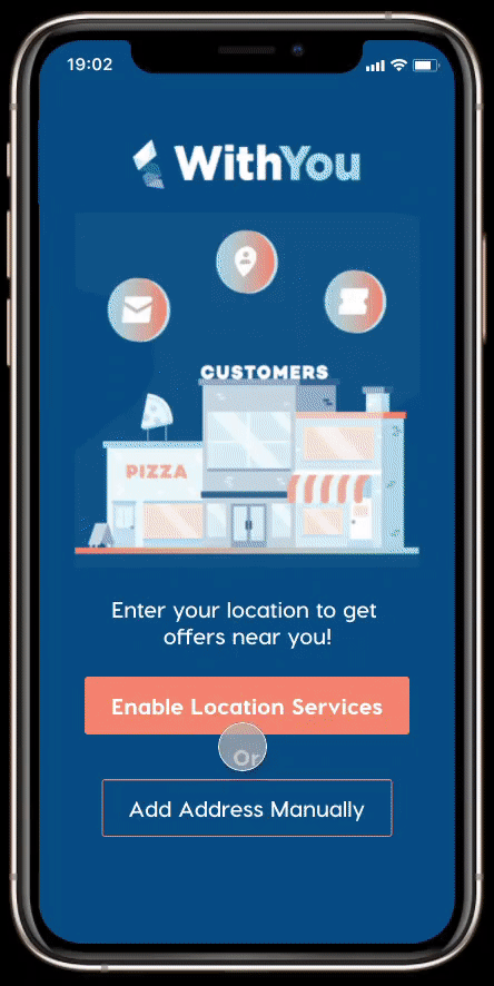
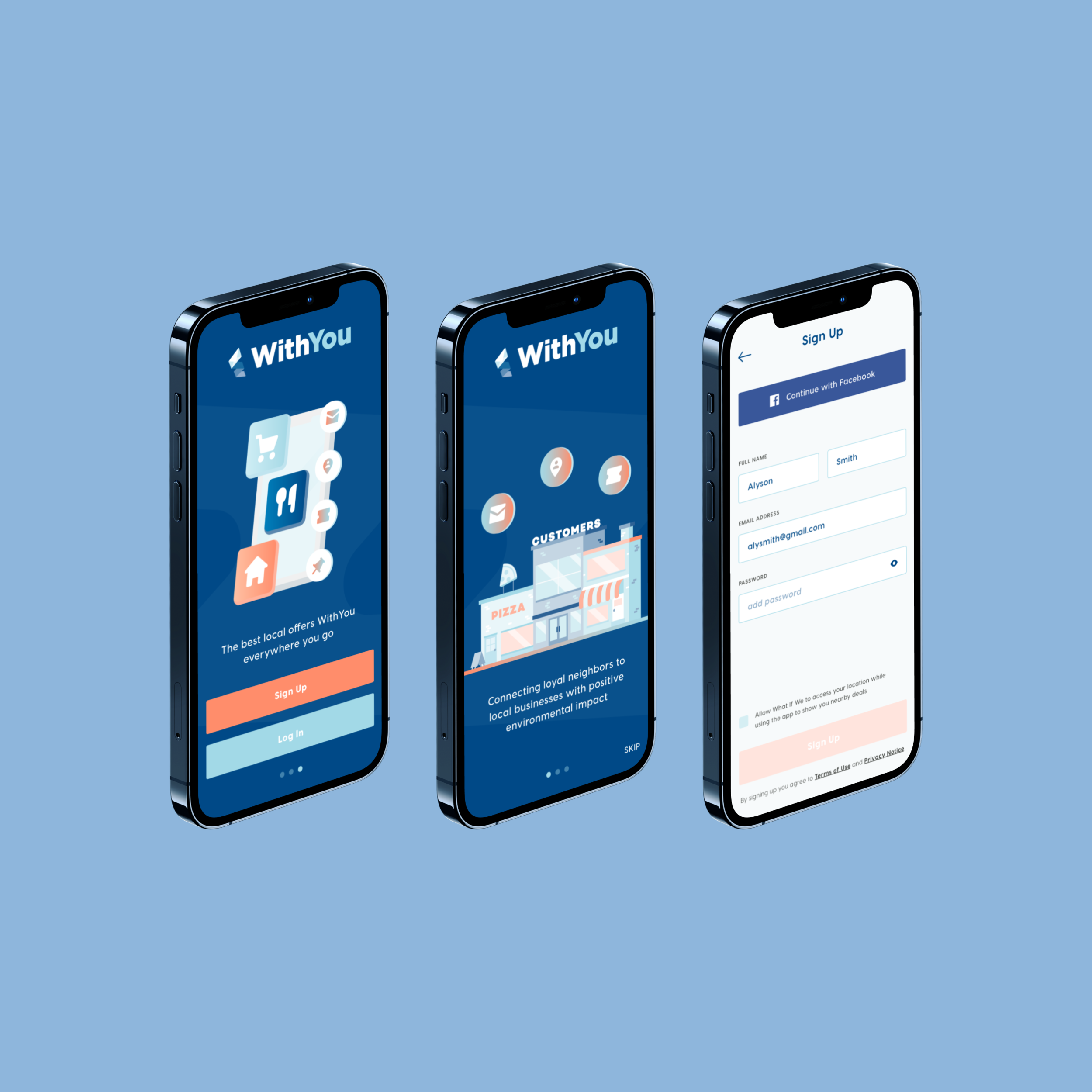
We implemented a “login-less” onboarding interface to cut down on the number of screens needed to access offers. Utilizing this method, we slashed WithYou’s original process from 6 screens to just 1 to limit user fatigue.
Additionally, we wanted to emphasize a geo-location entry so that users could get immediately familiarized with their local offerings.


We redesigned WithYou’s original grid system into a “card” interface. We enlarged these cards to help users focus and read information more effectively while emphasizing visual elements such as the Save button.
Other changes included:
Simplification of primary navigation architecture to just a search bar, filter button, and drop-down menu that housed options such as Saved coupons.
Introduction of a bottom navigation bar that hosts the Offers button and Profile icon, which were previously located in the primary navigation.
Centering of the Upload function to emphasize its importance in the app.
One of the more subtle changes we made was toward the Upload feature. As arguably WithYou’s chief action, we wanted to encourage a speedier process towards uploading a coupon.
Users would simply press the Upload button and be prompted to either take a picture or select an image from their gallery. Overall, this cut down the number of screens from 6 to 3.

Assessing our design updates through user testing and feedback.

For our usability sessions, our team planned to test two iterations of the prototype. We wanted to try out our prototype’s onboarding experience and examine how our functionalities performed with our target demographics.
We created 3 distinct tasks that tested important features within the app:
Redeeming a saved pizza coupon.
Uploading a paper coupon.
Finding local dining businesses nearby for offers.
Metrics: Users were measured by overall time it took for them to complete the above tasks. We observed errors, statements, or questions regarding the navigation of the WithYou prototype.
Participants: We had a total of 5 participants for testing who were drawn primarily from the Greater Chicago Area. 4 engaged in the first iteration and 1 tested our improved second iteration.
Testing Method: Usability tests were conducted via Zoom conference call, where we observed live our users’ activity with the prototype.
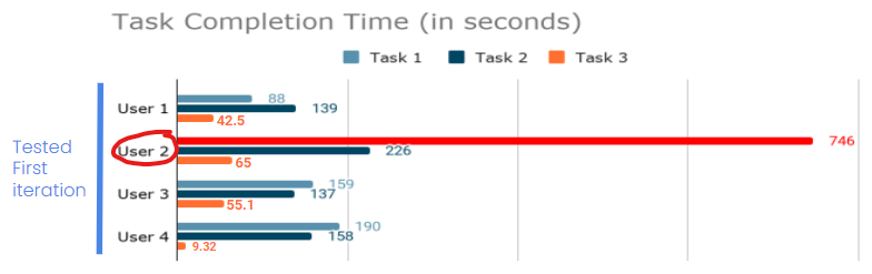
During our first usability testing session, we noticed several interesting results that caught our attention:
Users 1 and 2 generally expressed little to no difficulty completing the assigned Tasks.
Users 2 and 4 experienced moderate to significant difficulty completing specifically Tasks 1 and 2.
What took us admittedly most by surprise was how intensely User 2 struggled with completing Task 1. User 2 spent a whopping 746 seconds attempting to complete Task 1 and eventually gave up attempting to finish.
What were some of the challenges our users faced?
“I did get a little bit confused about the structure of the filter button.”
“My first instinct would be that the filter would be similar to a drop down. It was hard for me to understand that it was working on the same page.”
“I’m not sure if the “Upload offer” text pop-up is a button or not.”
What were some successes from our first testing session?
“The plus sign is pretty intuitive, it’s the universal sign for upload.”
“I think overall this is a good layout. I think this is pretty solid.”
“This would be pretty handy. I could follow my favorite restaurants. As a person living on a budget, this would really motivate me.”
“It’s like putting points into a rewards system. I think that is the easiest thing to take advantage of, a reward points system.”
Making final iterations to improve our prototype.

Our users experienced considerable strain trying to figure out how to utilize the top navigation in our first iteration. To ameliorate these issues, our team implemented the following changes:
Removal of the Filter button, as it seemed to cause more harm than good.
Added a filter carousel so that users can directly view what kind of filtering options are available to them.
Saved function placed explicitly in the primary navigation so users can easily access stored offers.
Redesign of the drop-down menu to make it more visually prominent and apparent as a function.
Harkening back to insights from our user interviews, we made these design choices to help users more effectively customize their options and find relevant local business offerings right on the home page.
The overwhelming majority of our users in both testing and interviews responded positively toward the idea of combining WithYou’s coupon focus with a loyalty program of some sort. In keeping with maintaining sustainability and feasibility for local businesses, we designed a Loyalty QR system profile that customers could use to scan at their favorite stores.
We envisioned that this program would incentivize consumers to shop local while fostering stronger relationships within the community.


While we initially anticipated the Upload function to be intuitive enough, it turned out that a few of our users inquired as to what the plus symbol really meant!
We decided to incorporate a “tool tips” modal that would inform first-time users clicking the Upload button on what to do.
Evaluating our updated iteration with one more usability test.

A beautiful sight, isn’t it?
While we were unable to recruit more than 1 participant for our second round of iteration testing, we felt certainly more heartened seeing our prototype seemingly benefit from our updates.
User 5 was asked to perform the same 3 Tasks given to the participants of the first round. In all 3, User 5 completed all tasks with no difficulty. User 5’s performance was a drastic improvement, indicating that our changes did make WithYou’s functionalities more intuitive.