
Project Context
My UX Design Immersive boot camp cohort received our first collaborative project. Specifically, our assignment prompt asked us to design a desktop site and app on behalf of FEMA for Houston residents during a natural disaster. According to the brief, FEMA did not have a preexisting method or tool that would have helped Houston residents during Hurricane Harvey find and reunite with their lost pets.
The project sprint took place between December 14th 2020 - January 4th, 2021. Over the course of this period, we developed and defined a solution that would allow shelter owners, professionals and volunteers to better serve Houston residents in locating their lost pets in the event of a natural disaster.
Project Constraints

What was my role in the project?
In my four-person team, I served as a UX designer with a primary focus in user research and usability testing.

What UX principles were used?
Our team utilized the following UX theories and principles to solve the problem:
Design theory
Design system
Visual hierarchy
Visual design
What tools did you use for this project?
In order to achieve a holistic understanding of the issue, we performed:
Affinity mapping
Comparative analysis
Figma & Sketch
User interviews
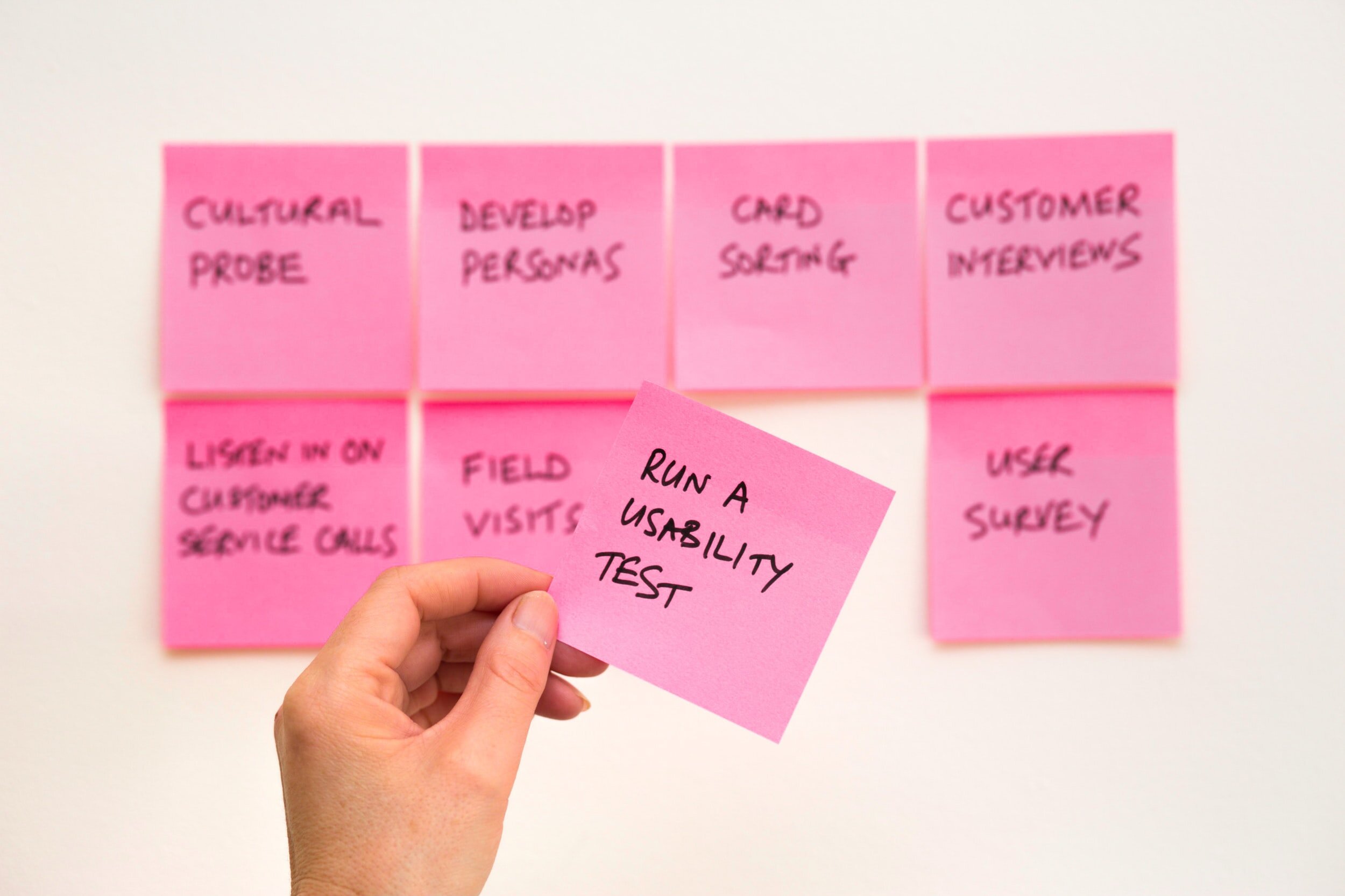
Usability tests
Project Timeline

Research

What did we find out about the City of Houston and its people?
To finetune our approach, we performed extensive background research into Houston’s profile. We wanted to understand at a high-level the demographics of the city and how its inhabitants had previously prepared for hurricanes such as Harvey.
We uncovered information on:
Local rescue groups
Extent of displacement caused by Hurricane Harvey
Number of disaster centers
Number of animal shelters
FEMA’s current disaster protocol

Who did we speak with?
In order to better funnel our problem and solution, we interviewed five different individuals from the Houston area to learn about their experiences with Hurricane Harvey. The interviewees were, in one capacity or another, shelter professionals and volunteers who were involved with animal shelter relief. As the user researcher, I especially wanted to know their perspective on natural disaster preparedness, community partnerships, and the intake process of lost pets.
Synthesis

Key Trends From Interviews
From our interviews, there were several takeaways that were recurrent themes from our participants. To gain clarity over the data, our team performed an affinity mapping session. We organized these insights into six main categories below:
Logistics of managing pets
Shelter management
Volunteers on the ground
External group collaboration
Desired features and functions
Information sharing and social media
Based upon the information above, we ascertained that our solution should provide functionalities that would adequately address or support all six themes.
User Personas
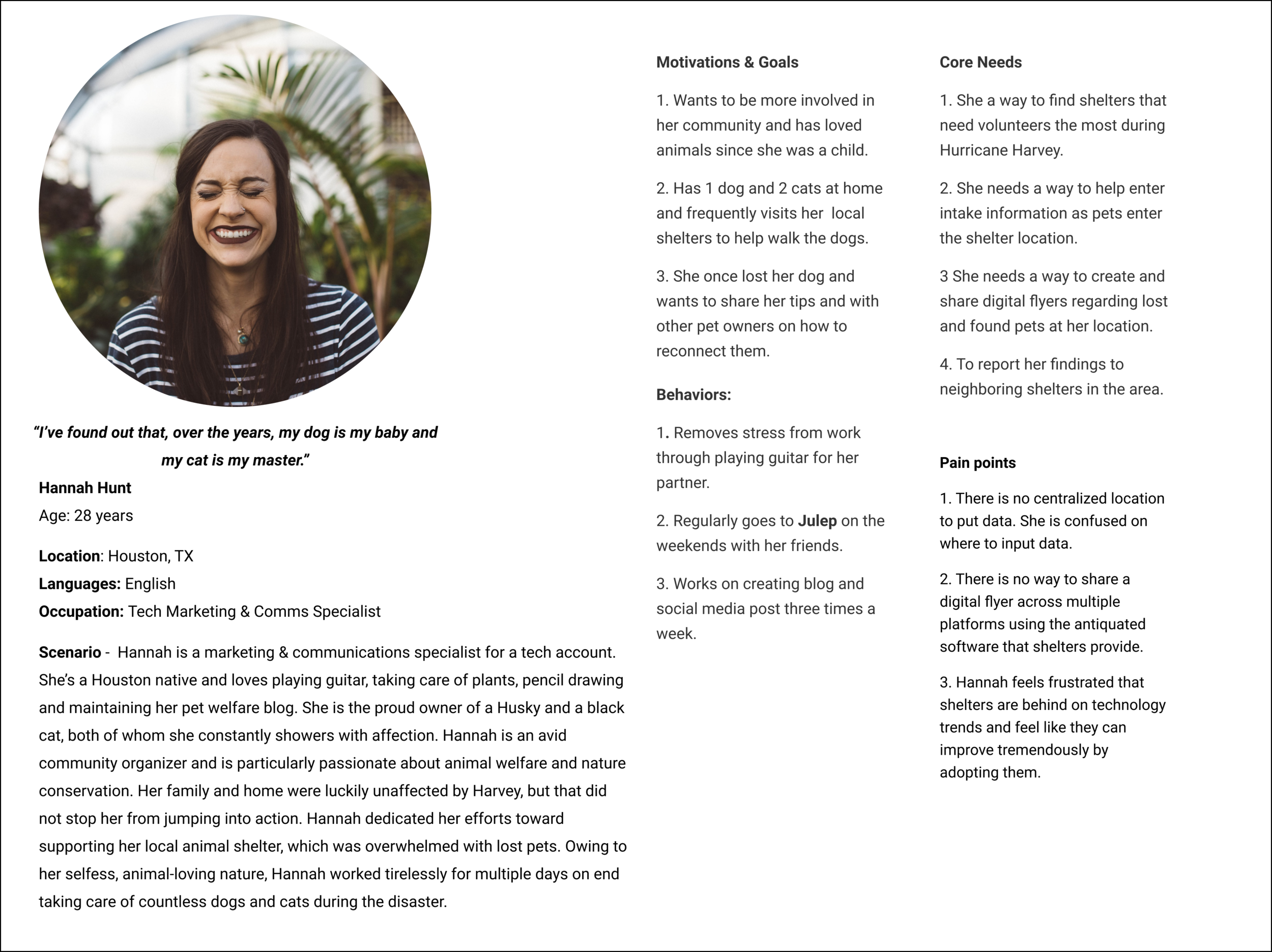
The Volunteer
Hannah Hunt represents the prominent younger population of Houston, of which 65% of its inhabitants are under the age of 64. Through our research, we uncovered that many young adults volunteered to assist local shelters during Hurricane Harvey in order to support overwhelmed staff. One of our interviewees noted critically, “There were many types of people involved” with disaster relief during Harvey, a clear indication that people of all walks of life in Houston enjoy strong community bonds.

The Shelter Owner
Valeria Villanueva manifested primarily from our interviews as the majority of our participants were shelter professionals. A few common characteristics that we observed from our interactions with interviewees included frustration over a lack of a centralized database for pets and a tool to help share lost pet information. To pay homage to Houston’s rich Latin-American heritage, Valeria is fluent in both Spanish and English.
Problem Statements
We noticed from our affinity maps and interviews that users especially noted the importance of information sharing and location services.
After consolidating our findings, we determined that FEMA had two problem statements that we needed to tackle.
FEMA needs a way to show available pet shelters through location and pet intake updates so that pet owners can narrow their search to find their lost/found pets.
FEMA needs a way to create and share information through digital flyers so that volunteers and shelters can share lost/found pets during a disaster.
Solution Ideation Exercise

Crazy 8’s
Making sense of all our data proved to be a bit of a challenge. It was difficult to conceptualize exactly what our solution would look like. To help jumpstart our ideation into what kind of features and functions our solution should offer, our team performed several Crazy 8’s exercises to get down visually represent potential routes.
We ended up sharing quite a few ideas in common, paving the way for our solution statements.
Solutions & Deliverables
Solution Statement
In order to solve this problem, FEMA needs to provide a highly durable GPS collar that includes a reference ID number and barcode ingrained to help pet owners and shelter professionals easily find/ID missing pets.
Once the barcode is scanned via the app or website, it will alert nearby shelters, create digital flyers to share via social networks, and will automatically print physical flyers at nearby shelters. It will also alert pet owners when their pet has been located and provide a geolocation map with shelter information.
Usability Testing Results

We recruited five Houston residents to take part in usability testing of our app and desktop prototypes. Users were asked to complete two specific objectives that tested important aspects of our solution and our interface. The tasks were as follows:
Mobile App Task: C
an you show me how you would register your pet?
Desktop Task: Can you show me how you would find a pet-friendly shelter from the home page?
Our tests revealed that 5/5 users expressed little to no difficulty completing the Mobile App Task. 4/5 users had little to no difficulty completing the Desktop Task. However, 1/5 users experienced considerable difficulty completing the Desktop Task.

Mobile App Observations

Desktop Observations
Design Feedback Implementations

Petfi Mobile App IA Modifications
While users generally felt that the Petfi Mobile App was easy to use, we believed that the pet registration process could be simplified even further. To help users find primary actions in one place, we merged the former primary navigation tabs into a “hamburger” menu.

Petfi Desktop IA Modifications
Changes to our desktop’s architecture required a few more structural changes. Several users noted during the testing session that the “Search by Location” link and naming of “Disasters & Resources” primary navigation tab contributed to their confusion as to where to navigate. Per user suggestions, we eliminated the “Search by Location” feature from the Home Page and renamed “Disasters & Resources” to the more coherent “Disaster Resources.”
Petfi Final Deliverable Samples


Reflection
Revise with realism.
Our team felt deeply connected to our solution of providing a GPS dog collar. We did not factor costs associated with purchasing the collar and how FEMA would pragmatically mass-produce them. Taking into consideration that more than 20% of the population of Houston lives in poverty, we will need to revise the accessibility of this solution in order truly serve as many residents of the city as possible.
Improve my UI skills.
One of the areas of UX that I believe I need to develop more confidence and competence in is UI. As someone who comes from a background completely devoid of art, design, or visual expertise, the UI elements of this project were undoubtedly a challenge for me.
Think big. Then small.
Often times during this project, I found myself at a loss of how to best connect the problem to the solution. I didn’t realize this at the time, but my instructors insightfully commented that this experience can often be caused by constricting oneself into a box too early on. Though I consider myself a creative person, I will need to encourage myself to “think big, then small” for future projects in order to avoid confounding myself in the ideation process.