
Transforming Goettl’s outdated desktop tool into a seamless dual-experience mobile app—empowering employees with an optimized platform on the go.
I owned the full end-to-end research and design of the 8-week Daily Strategic Compass initiative as the Lead Product Designer representing Oxy, a design agency. A 0-to-1 design, I replaced an aging, obsolete desktop interface with a powerful mobile app that enables technicians the ability to track their performance and field managers to oversee their teams.
I uncovered staff needs, designed intuitive mobile-first workflows from the ground up to replace legacy desktop processes, and delivered an MVP that streamlined task management, performance tracking, and team oversight.
Before

After

Technician Experience

Manager Experience
Background
Goettl is a regional HVAC company headquartered in Las Vegas, Nevada. Established in 1939, it specializes in providing a full range of services for AC and heating equipment, including repair, maintenance, and diagnostics.
The company has over 900 field managers and technicians working in branches dispersed around the West Coast and South Central regions of the United States.
With its large base of skilled trade workers, Goettl relies heavily on the reliability and performance of its field staff in order to sustain growth.
However, like many companies in this industry, Goettl was still relying on antiquated software and platforms, and did not have dedicated in-house IT professionals to introduce digital improvements.
Core Problem Identified
Goettl lacks a dedicated mobile platform for field technicians and managers, making it difficult to track performance metrics, manage sales, and communicate effectively.
While the Daily Strategic Compass (DSC) desktop tool exists, its usability is severely limited—especially for technicians in the field who have minimal computer access. Additionally, the interface has been widely criticized for being overly complex and ineffective, resembling a “glorified Excel spreadsheet.”
With the majority of employees operating in non-software and administrative roles, the absence of a mobile solution has created company-wide inefficiencies in performance tracking, communication, and sales management. A more accessible, user-friendly platform may improve workforce engagement and operational effectiveness.
My design agency, Oxy, was contracted to address these issues. The Agile team consisted of the following:

Project Structure
This 2-month initiative focused on developing a mobile-first MVP for Goettl’s field technicians and managers—a solution built from the ground up with no existing mobile reference.
With limited knowledge of Goettl’s staff workflows or key data needs, my research centered on interviews, surveys, and comparative analyses of sales and metrics-driven mobile applications.
The project was highly collaborative and iterative. Research insights were quickly shared in Agile working sessions, while wireframes underwent rapid cycles of ideation, critique, and finalization to ensure an effective design.
User Research

Goal
Understand and discover the main tasks that techs and managers need to complete, what types of info they rely on, and any challenges they currently face
Methods
User Surveys
Interviews
User Stories & Flows
Comparative Analyses
Usability Testing
Users
Goettl field technicians
Goettl field managers
MVP Design

Goal
Brainstorm and create a dual-experience mobile app (iOS-focus) MVP to replace the desktop tool
Methods
Wireframes
Concept value tests
High-fidelity prototype
Constraints
No access to legacy desktop version
MVP must be shipped within 2-month timeline
Limited face-time with techs & managers
Given the relatively short timeline, I immediately set to work on uncovering the needs of our users.
Research
Gathering qualitative insights into the needs of Goettl’s field employees
A considerable hurdle I had to overcome was the fact that I was not given access to Goettl’s desktop interface. Due to company policies, our team was not permitted to view or use the tool. Therefore, I had to build a foundation of user requirements for the mobile app from the ground-up.
Goettl’s field-based work environment meant limited direct access to users. To maximize our interactions, I curated a survey to uncover their needs, goals, and pain points.
With the help of my Product Manager, Steven, who served as our primary liaison with Goettl, we recruited 6 technicians and 5 field managers to participate in our research study.

While survey responses were being collected, I took an extra step by conducting user interviews with 5 technicians and 5 field managers to gather deeper qualitative insights.
Both the survey and interviews covered the same key questions, including:
What information is most important to you on the field?
What KPIs & metrics are most important to you?
How do you currently use the desktop Goettl application?
What is your typical working day like on the field?
What do you wish you could do that you currently cannot do on the desktop tool?

After collecting this information, I performed an affinity map exercise to funnel the wide-ranging responses from my users into digestible themes.

I synthesized the results from the surveys and interviews and discovered the following insights from Goettl’s field techs and managers.

Additionally, our users responded that the most important metrics they used on a day-to-day basis were:
T/O Rate
MFO Rate
DFO Rate
2D Usage
Compliance Rate
Average Time on Job
Number of Callbacks
Average Demand Revenue
Sales Revenue
Analyzing the industry landscape for design inspiration
To conceptualize the information architecture and visual design of Goettl’s mobile app, I needed a strong reference point. Given Goettl’s needs, I identified a natural alignment with sales-oriented apps and CRMs.
I researched platforms like HighSpot, Outreach, and Salesforce, analyzing typography, visual cues, and layout patterns to inform my design approach.

Through comparative analysis, I identified key trends in information display, accessibility, and breakdown. These insights shaped the following information architecture and design decisions:
Home dashboard with a metrics overview
Filters to toggle between macro and micro data views
Gamification elements to boost motivation and rankings
Notifications & reminders for key updates
Visual performance indicators to track progress
Throughout this process, my Product Manager Steven and Creative Director Anthony were in lockstep with the information I had synthesized. After a quick discussion, I informed them I was ready to begin creating design concepts.
Design
Constructing user flows to conceptualize potential designs
To structure my approach, I began by creating user flows to define UI behavior and essential functionalities.
With no access to the previous desktop DSC, I relied on insights from technicians and managers to map out key workflows. For the MVP, our team collaborated with Goettl to prioritize two critical flows: Manager Feedback and Technician Call Review.

Manager User Flows
Issuing management actions, such as creating feedback & scheduling training
Reviewing top & underperforming techs
Tech User Flows
Reviewing previous calls
Viewing performance data
Sketching & performing quick concept value tests
The user flows I created were carefully vetted and reviewed by Steven and Anthony. After securing their greenlight, I moved quickly to start putting pen to paper.
To determine which design best resonated with Goettl’s field employees, I conducted concept value testing using two low-fidelity wireframe prototypes.
Model A – A grid-style layout, prioritizing simplicity.
Model B – A visually driven approach inspired by comparative analyses, incorporating metrics and gamification elements.
This test helped assess which design direction aligned best with user needs.

I collaborated with Steven to share the initial landing page wireframes with 4 technicians and 5 managers.
The response was clear—employees overwhelmingly favored Model B over Model A.
Rapid wireframing
Using Model B as my foundation, I began wireframing the Home Page Experience for both technicians and managers. My approach focused on establishing a strong starting point for each user type before developing their specific workflows.


Next, I designed screens for role-specific tasks essential to technicians and managers. For the MVP, we prioritized two key workflows: Call Review for Technicians and Feedback Issuance for Managers.
For techs, to enhance motivation and engagement, I integrated technician feedback by designing a review sequence that prompts them to reflect on their client calls.

Managers needed a mobile tool to issue management actions, such as providing feedback, while on the go. Alongside tracking technician performance metrics, this became a core function in their daily workflow.

Throughout the design phase, I collaborated closely with Steven, Anthony, and the Agile team, incorporating their insights while maintaining an efficient two-week turnaround.
With the Home Page Experience and user-specific task flows completed, the team approved the designs and proceeded with usability testing.
At this stage, we encountered a predictable yet challenging obstacle.
Usability testing
Lack of available Goettl employees for dedicated testing
At this stage, we had hoped to recruit a pool of technicians and managers for usability testing, similar to our research phase. However, after updating Goettl on our progress, it became clear that a comprehensive usability test wasn’t feasible on their end.
With time constraints limiting our options, we couldn’t afford to wait for participants. Anticipating this challenge, I proposed a modified guerilla testing approach as a scrappy yet effective workaround:
Modified Guerilla Testing (1 week)
Objective
To evaluate the dual-experience mobile DSC prototype UI and its features.
Method
Send out prototype to Goettl’s techs and managers in a mass communique requesting any available participants to use it
Users will send back any critique or thoughts on a rolling basis via any communication channel, including messages, email, phone call, and video chat
Structure
Unmoderated, untimed
Mobile phone required
Participants can test the prototype in any environment they wish
Technician Tasks
Complete the action of reviewing a Call.
How was your experience completing this task?
What are some things that can be improved?
Now, find and where you would open your DSC dashboard. Sift through Goals, Home, Messages, and Notifications.
What do you see here?
What is your opinion of the information laid out here?
What parts of this would you use most often?
Locate where you would access your performance rankings against other techs.
How was your experience completing this task?
What are some things that can be improved?
Find a way to view your performance metrics over the last month.
How was your experience completing this task?
What are some things that can be improved?
What are your thoughts overall on this prototype?
What, if anything, is missing from this?
Technician Prototype

Manager Tasks
Open the prototype.
What do you see here?
What is your opinion of the information laid out here?
What parts of this would you use most often?
Find the technician that you need to issue feedback to.
How was your experience completing this task?
What are some things that can be improved?
Please provide feedback to the technician.
How was your experience completing this task?
What are some things that can be improved?
Please schedule a training session for the technician.
How was your experience completing this task?
What are some things that can be improved?
What are your thoughts overall on this prototype?
What, if anything, is missing from this?
Manager Experience

Additionally, Steven had been working with Goettl for months prior to the project launching and had general knowledge of user needs, so in the case of limited user responses, he would step in to provide feedback.
Gathering test results for actionable hi-fi redesigns
My guerilla testing yielded four participants—two technicians and two managers. Despite the small sample size, overall sentiment was positive, with users valuing the mobile-first approach and core functionalities.
However, feedback also revealed key usability challenges. Using these insights, I refined the prototype to enhance usability, ensuring the design evolved to meet real user needs.
Technician Experience Redesigns
Usability testing results for the technician designs surfaced fewer critical issues, indicating that the existing design largely met user needs. While feedback was lighter compared to the Manager Experience, I focused on refining key design elements and making small but meaningful improvements to enhance usability and efficiency.
Home Page


The Review Call flow proved to be a valuable tool for technicians, allowing them to easily reflect on past work. Usability feedback was minimal, affirming its effectiveness, with only a few refinements made to enhance clarity and usability.
Review Call Experience

Manager Experience Redesigns
Testing revealed that the Manager Home Page overemphasized qualitative feedback while underrepresenting key performance metrics like Warranty, Demand, and Maintenance. My initial design focused on manager-technician relationships, highlighting feedback and employee wellness insights, but usability testing showed that managers prioritized performance data over this approach.
Compared to the Technician Experience, the Manager Experience required significantly more redesigns, as testing uncovered greater opportunities for improvement. In response, I redesigned the Home Page to prioritize critical metrics while still allowing managers to provide feedback when needed.
Home Page

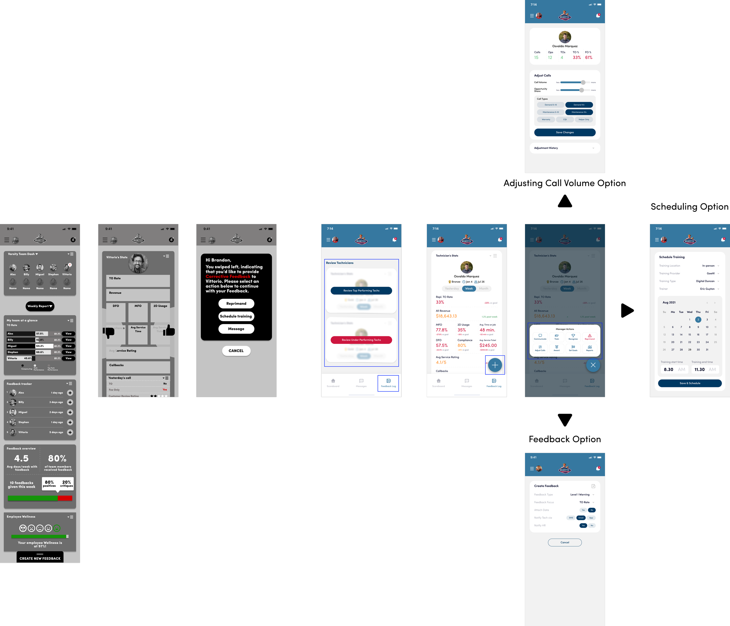
In my initial design, I introduced a left-right swiping interaction for managers to review technician performance—left for corrective feedback, right for kudos—followed by a modal with management actions. However, usability testing revealed that managers found this interaction unintuitive and confusing. They also disliked swiping up to access the 'Create New Feedback' modal on the home page.
To improve usability, I redesigned the experience with a more structured workflow. Instead of swiping, managers now access a dedicated 'Feedback Log' in the bottom navigation, where technicians are clearly categorized by high and low performance. Within a technician’s profile, the swiping gesture was replaced with a Floating Action Button (FAB), opening an Action Sheet that consolidates all key management actions—including feedback, training scheduling, and call volume adjustments.
Feedback Experience

Outcomes
Prototype finalization & design overview
With the redesigns implemented, I created an interactive prototype in preparation to work with our engineer Colin. I also shared the results with Anthony and Steven to prepare for next steps with Goettl.
Goettl’s core challenge was the lack of a dedicated mobile platform for field technicians and managers, making it difficult to track performance metrics, manage sales, and communicate effectively.
But what did their employees truly need? Let’s break it down.
Technician Experience

Technician Needs:
Performance tracking for key metrics.
A service log to record reports of completed work.
Stronger motivation and connection to their work.
A way to compare performance with peers.
Design Solution:
A gamified dashboard that enables technicians to track performance metrics, manage service reports, and monitor goals in real time. Gamification elements keep them motivated in the field, fostering competition and continuous improvement.
Manager Experience

Manager Needs:
Track team and individual technician performance metrics.
Execute key management actions (e.g., feedback, training scheduling).
Identify and review top and underperforming technicians.
Design Solution:
A data-driven dashboard that delivers clear, actionable insights into team performance with quick access to key metrics. The management command center enables managers to zoom in or out on technician performance, providing oversight while seamlessly executing feedback, training, and development opportunities on the go.
MVP handoff preparation
After completing my research and design work, my focus shifted towards preparing the MVP for our Goettl clients.
Our team is currently wholly focused with developing strategies for contract negotiations with Goettl, and to aid in this end, we curated demo sessions to highlight the functionalities of the Technician and Manager Experience. Additionally, I ensured that my process was well-documented and organized.

Prototype Demonstrations

Research & Design Documentation
Next steps
With the MVP successfully designed, the next steps focus on validating usability and preparing for client adoption:
Conduct a Comprehensive Usability Test
Since initial testing was limited, a full-scale usability study of the high-fidelity prototype will ensure the design meets real-world technician and manager needs
Gather feedback to refine interaction flows, performance tracking, and management tools before implementation
Prepare the MVP for Client Demo & Contract Negotiations
Finalize the prototype for a formal presentation to Goettl stakeholders
Highlight key improvements, efficiency gains, and business value to support contract discussions and secure buy-in
Establish Outcome Metrics for MVP Success
To fully demonstrate the MVP’s impact over the legacy DSC desktop version, tracking key performance metrics (e.g., task efficiency, adoption rate, user satisfaction) is essential. Quantifying these improvements will provide valuable insights for future iterations, validate the effectiveness of the mobile solution, and help drive stakeholder confidence in long-term adoption
By focusing on comprehensive testing and strategic client alignment, these steps will ensure a seamless transition from prototype to implementation, setting the foundation for long-term success
Reflections
Leading this project as the lead product designer came with unique challenges that pushed me to think critically and adapt quickly:
Limited Usability Testing: Without full access to users, I relied on guerilla testing with four participants to gather actionable insights. This reinforced the value of flexible research methods and making the most of available data.
No Access to the Legacy Desktop Tool (DSC): Since I couldn’t reference the old system, I reconstructed user workflows based on surveys and interviews. This experience highlighted the importance of leveraging user insights to bridge knowledge gaps
First Time in a Lead Role: Owning the entire design process required balancing strategic thinking and execution. I embraced collaboration and iterative feedback, strengthening my ability to lead with confidence
This project sharpened my ability to problem-solve in ambiguous situations, adapt to constraints, and advocate for user needs even with limited resources. It reinforced that great UX design isn’t just about perfect conditions—it’s about making informed, iterative decisions that create meaningful impact.